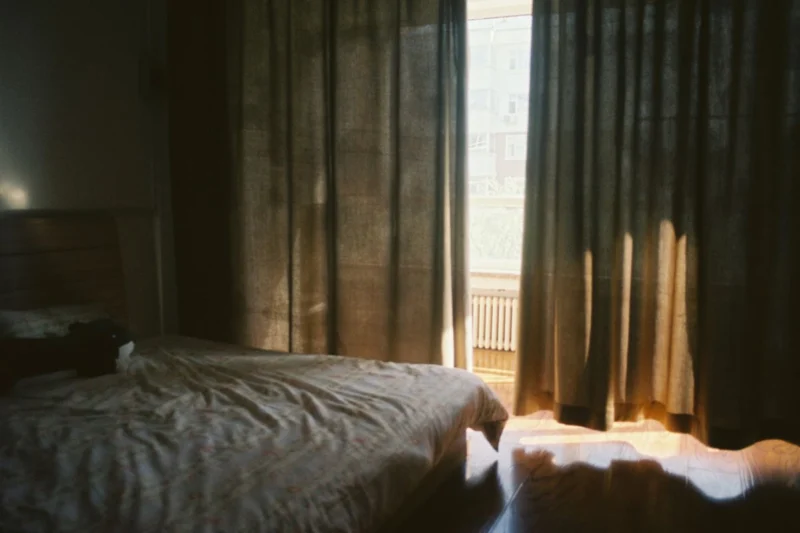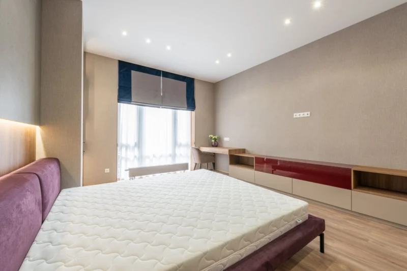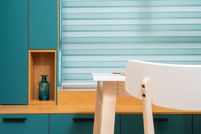
Choosing blinds for a whole house raises a question most people only face once: do they all need to match? The short version is no, but there is a smart way to vary them so the house still looks considered from the street and from room to room.
Quick answer: Not all the blinds in your house need to match. What matters most is how the windows look from outside, so keep street-facing blinds consistent in colour, or choose fabrics with white or neutral backs. Inside, pick fabric by each room’s needs, keeping one colour family where rooms connect or share a view.
Should all the blinds in your house match?
All the blinds in your house do not need to match, and a completely uniform scheme can look flat indoors. The sensible approach is consistency where people see several windows together, such as the front elevation and open-plan spaces, and freedom elsewhere. Function comes first in each room, with colour and texture tying the house together.
Think of your home as having two audiences. From outside, neighbours and passers-by see a row of windows at once, and mismatched colours or different backings read as untidy. From inside, you rarely see more than one or two rooms at a time, so each room can have the fabric that suits it.
That gives a simple framework:
- Outside view: aim for consistency across each elevation, especially the front.
- Inside, connected spaces: keep a shared colour family or the same fabric where rooms open into each other.
- Inside, separate rooms: choose freely, based on light, privacy and moisture.
Should blinds at the front of the house be the same colour?
Blinds at the front of the house look best when they read as the same colour from the street, because the front elevation is seen as a whole. That does not mean every room needs identical fabric. Many coated fabrics have a white or neutral back, so different face colours inside can still look uniform from outside.
This is the single most useful fact when planning blinds for a whole house. On many blackout and coated fabrics, the side facing the glass is a white, off-white or pale neutral backing, whatever colour faces into the room. From the pavement, a charcoal blind in the lounge and a soft green blind in the bedroom above can look almost identical.
A few points to check when you compare samples:
- Look at the back of each fabric. Is it the same colour as the front, or a neutral coating?
- Compare backs side by side. White and cream backings look different next to each other in daylight.
- Consider unbacked fabrics. Light-filtering and sunscreen fabrics usually show the same colour on both sides, so from outside you see the room colour.
- Check at night. With lights on behind them, light-filtering fabrics glow and show their true colour, while blackout does not.
Our free fabric samples are the easiest way to test this. Hold them up in the window from inside, then step outside and look back at the house.
How a row of windows reads from outside
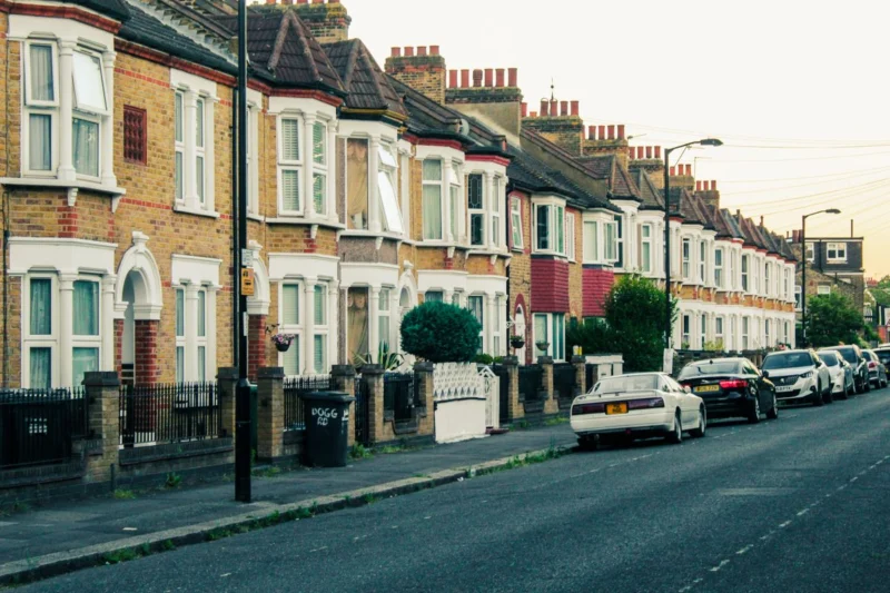
From the street, people notice three things: colour, how far down each blind is, and how each blind sits in the window. A tidy frontage has similar colours, similar drop heights when lowered, and blinds fitted the same way, whether inside the recess or across it. Getting the fitting method consistent across the front of the house is as important as the fabric.
How do terraces and semis in London look best from the street?
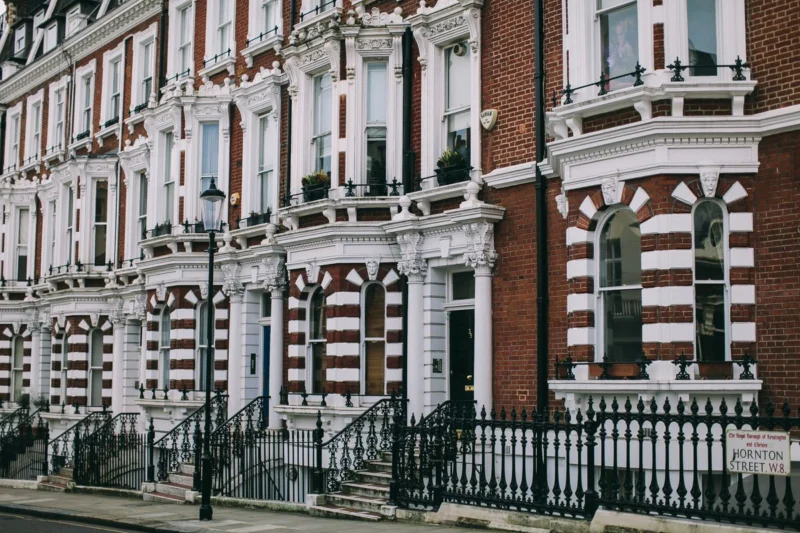
Terraced and semi-detached houses in London and the surrounding suburbs usually sit close to the pavement, so the front windows are seen at short range and all at once. Neutral backs, consistent fitting and similar drop heights keep a tidy frontage, especially where bay windows and upstairs sashes line up above each other.
Much of the housing across London, Essex and North Kent follows familiar patterns: Victorian and Edwardian terraces with a bay downstairs and sash windows above, 1930s semis with wide bays on both floors, and newer flats with large glazed walls facing the street. Each has its own challenge.
- Victorian and Edwardian terraces: the bay and the bedroom window above it frame the whole front. Matching the outward colour of these two makes the biggest difference.
- 1930s semis: two stacked bays make the front very visible. Consistent drop heights across each bay matter as much as colour.
- Flats with large windows: from outside, a block reads as a grid. A neutral back keeps your windows from standing out, and some buildings have their own rules about window coverings, so check your lease.
None of this is a rule you must follow. It is simply how a front elevation is perceived when windows sit close to the street and to the neighbours on either side.
Can you mix blackout and light-filtering blinds in the same house?
You can mix blackout and light-filtering blinds in the same house, and most homes need both. Bedrooms suit blackout, while living spaces and kitchens usually suit light-filtering or sunscreen fabrics. To keep a coordinated look, choose both fabrics from the same colour family, and check how each looks from outside during the day and at night.
Mixing fabric types is where matching gets tricky, because blackout and light-filtering fabrics behave differently:
| Fabric type | Typical rooms | How it looks from outside | Matching tip |
|---|---|---|---|
| Blackout | Bedrooms, nurseries, media rooms | Often a white or neutral back, no glow at night | Choose a backing close to the other front windows |
| Dim-out or light filtering | Living rooms, kitchens, dining rooms | Same colour both sides, glows at night | Pick a pale or neutral shade for street-facing windows |
| Sunscreen (solar) | Sunny living spaces, home offices, conservatories | Same colour both sides; darker shades tend to give a clearer view out | Keep to one tone across a run of windows |
| Day and night | Living rooms, bedrooms needing privacy by day | Striped effect, same both sides | Use consistently across an elevation, not in one window |
| Moisture-resistant | Bathrooms, kitchens | Depends on the fabric | Match colour family to neighbouring windows if street-facing |
A common approach is to choose one neutral, such as a soft white, stone or light grey, and find it in several fabric types. A white blackout in the front bedroom and a white light-filtering blind in the lounge below look coordinated in daylight. If you are weighing up the two fabric types for a particular room, our comparison of blackout vs sunscreen roller blinds explains the trade-offs.
Should blinds match in an open-plan space?
Blinds in an open-plan space should match, or at least share one colour and fabric family, because every window is seen together as one room. A kitchen, dining and living area with mixed blinds usually looks disjointed. If one zone needs a different function, such as moisture resistance near the sink, choose a fabric in the same tone.
Open-plan layouts are common in extended Victorian houses and in new-build flats across East London. The same rules apply to both:
- Keep one colour across the whole space. Differences in fabric type matter less than differences in colour.
- Keep drop and fitting consistent. Blinds at different heights across a run of windows look accidental.
- Use texture for interest. A plain fabric at the kitchen end and a subtle weave in the same colour at the living end can work well.
- Think about the operation. Mixing chain, cordless and motorised in one room is fine, but chains on the same side of each window look tidier.
Sliding and bi-fold doors often sit in the same space as standard windows. Where the doors need blinds too, keeping the same fabric across both makes the whole wall read as one.
How should blinds relate to walls, window frames and bay windows?
Blinds should relate to the colour you see most around them: the walls, the window frames and the other blinds in the same view. White or neutral blinds blend with white uPVC frames, while stronger colours work as a feature against pale walls. In bay windows, every section should use the same fabric so the bay reads as one.
Walls and frames
Most homes have white uPVC or painted timber frames, and a pale blind next to a white frame keeps the window quiet. Anthracite grey frames, common on newer homes and extensions, suit grey, charcoal or stone fabrics. If you want a strong colour, use it in a room where the blind is seen from inside against a plain wall, and rely on a neutral back to keep the outside view calm.
Bay windows
A bay window is effectively one window made of several panes, so the blinds in it should always match each other. That means the same fabric, the same fitting method, and brackets set so the tops line up. Mismatched drops in a bay are very noticeable from both inside and outside. Our guide to roller blinds for bay windows covers how to handle the angles and the gaps between sections.
Adjoining rooms
Where two rooms connect through a wide opening or double doors, treat them like a partial open-plan space. A shared colour family, even if the fabrics differ, helps the eye move from one room to the next without a jolt.
Which rooms can have different blinds?
Rooms that are not seen together, and whose windows face the back or side of the house, can have different blinds freely. Bedrooms, bathrooms, children’s rooms and home offices each have specific needs, such as blackout, moisture resistance or glare control, and those needs should lead. Rear windows are rarely viewed as a set, so colour can be more personal.
- Bedrooms: blackout for sleep, with the face colour chosen to suit the room.
- Bathrooms: moisture-resistant fabric first, colour second.
- Kitchens: wipe-clean and moisture-resistant near sinks and hobs.
- Children’s rooms: a fun colour inside is fine, with a neutral back if the window faces the street. Cordless or motorised operation avoids chains, and RoSPA advises against looped cords or chains in a child’s bedroom.
- Home offices: sunscreen fabrics cut screen glare while keeping daylight.
For main living spaces, our guide to the best roller blinds for living rooms walks through light, privacy and colour choices room by room.
What are the best rules of thumb for coordinating blinds?
The best rules of thumb for coordinating blinds are to keep the front elevation consistent from outside, match every section of a bay, use one colour family in open-plan spaces, let function lead in private rooms, and test samples in the actual windows. Neutral backs give you freedom inside without making the outside look patchy.
- Start from the street. Decide how the front should look, then work inwards.
- Pick a base neutral. One white, stone or grey that appears in several fabric types.
- Allow feature colours in private rooms, ideally on fabrics with a neutral back.
- Match within each view. Anything you see together should coordinate.
- Keep fitting consistent. Same method, same heights, same control side where possible.
- Test in real light. North and south-facing rooms can make the same fabric look different.
Key takeaways
- Blinds do not all need to match, but the front of the house should look consistent.
- Coated fabrics with white or neutral backs let you vary colours inside while keeping a tidy frontage.
- Open-plan spaces and bay windows should use matching fabric, or at least one colour family.
- Mixing blackout and light-filtering fabrics is normal; keep them in the same tone.
- Let each private room’s function lead the fabric choice.
- Always test samples in your own windows, from inside and outside.
Common mistakes when choosing blinds for a whole house
The most common mistakes when choosing blinds for a whole house are picking fabrics room by room without looking at the front elevation, mixing white and cream backings, fitting some blinds inside the recess and others outside, and choosing colours from a screen rather than real samples. Each makes a house look less coordinated than intended.
- Ignoring the back of the fabric: the side the street sees is often the one nobody checks.
- Skipping the night check: light-filtering fabrics look very different lit from inside.
- Different fitting methods on one elevation: recess and face-fitted blinds side by side look uneven.
- Matching too rigidly: putting blackout in a living room just to match the bedrooms leaves you in the dark.
Can I get help choosing matching blinds in London, Essex or North Kent?
HD Blinds offers a free home measure across London, Essex and North Kent, and brings fabric samples so you can compare colours and backings in your own windows. We measure every window ourselves, give a written, no-obligation quote, and our own team fits the blinds, which keeps the fitting method and heights consistent.
If you would rather start at home, order samples first and try them in the front and back windows at different times of day. It is the most reliable way to see how a scheme will read from inside and out.
Frequently asked questions
Do all blinds in a house have to be the same colour?
No. Blinds only need to look consistent where they are seen together, mainly the front of the house, open-plan spaces and bay windows. Other rooms can have different colours to suit their use. Fabrics with a white or neutral back let you vary room colours while the outside still looks uniform.
What colour blinds look best from outside?
White, off-white and soft neutral shades usually look tidiest from outside, because they blend with white window frames and with neighbouring houses. Many coated blackout fabrics have a neutral back whatever the face colour. With anthracite grey frames, pale grey or stone can look more considered than bright white.
Can I have blackout blinds upstairs and light-filtering blinds downstairs?
Yes, and many homes do exactly that. Keep both fabrics in the same colour family and check the backing of the blackout against the light-filtering fabric from outside. At night, light-filtering blinds glow when lights are on, so a pale neutral shade keeps the front of the house looking consistent.
Should blinds in a bay window all match?
Yes. A bay window is seen as a single feature, so every section should use the same fabric, the same fitting method and brackets set so the tops line up. Different fabrics or uneven drop heights in a bay are very noticeable from inside the room and from the street.
Should blinds match the walls or the window frames?
Blinds usually look best when they relate to the window frames and the other blinds in the same view, with walls a secondary consideration. Pale blinds suit white frames. Grey and stone suit anthracite frames. A stronger colour can work as a feature against a plain wall, ideally on a neutral-backed fabric.
Thinking about new blinds?
We measure and fit across London, Essex and North Kent. The visit is free and there is no obligation.